Email signatures are like business cards. They exist to meet an obvious purpose, so they’re pretty easy to not think much about. In fact, the HBR Guide to Better Business Writing, Bryan Garner offers just two sentences on the topic:
Use a signature that displays your title and contact information. It should look professional (not too long or ornate) and make it convenient for others to choose how to reach you.
Pretty straightforward, right?
While I think Garner gives us some good guidelines, the reality is a little more complex. Like a business card, email signatures are an extension of our marketing, so most of them are customized to meet business objectives beyond just exchanging contact info. But instead of the standard 3″ x 2.5″ format of a business card, we can’t be sure how an email will appear on the other side. Will your text formatting carry over? Will your logo appear in its full size–or even at all?
According to Rex Weston, who has made a career out of designing email signatures for others, a good email signature is
visually appealing and reinforces branding; achieves a happy medium in terms of content & hyperlinks; [and] functions as well as is possible and fails gracefully.
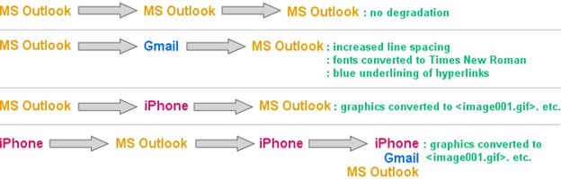
This echoes Garner — it has to look good without being too long — but what does he mean by failing gracefully?
As it turns out, not all email services and devices operate in the same ways. This means that if you’re sending a message to someone using Gmail, your fonts might change. If you’re sending it to someone on an iPhone, your company logo may appear as something like <logo.jpg>. It all depends on which kinds of servers and services everyone in the thread is using.
Design for Everyone
This doesn’t mean you can’t or shouldn’t use images, logos, or digital signatures in your emails. But it does mean it’s worth acknowledging that your email signature will not look the same in every scenario, so it’s best to plan for the worst and move up from there.
In a lot of ways, these are the same kinds of things we have to consider when building mobile-friendly, responsive websites. Because we can’t be sure what kind of device or browser someone may use to access our website, we plan for as many scenarios as we can.
In practical terms, this means using plain text where possible and consolidate images where you can. For example, instead of using six separate images to promote each of your social media pages, you might consider substituting text-based links. Or, you could direct them to a bio page that includes the same links/information that might not reliably display in email.
Recommendations
- Design for smartphones and limit images to 300px across
- Limit yourself to one image per signature
- Test your signature on multiple services


